
Last updated on May 20th, 2025 at 05:50 pm
So you are ready to place your first order of promotional products! One of the most important questions you have for your promotional products supplier is probably, how well will my logo print on the product? At the end of the day, what is the point of having promotional products if you can see the logo properly? In this blog post, we will go over a few important steps you can do to set up your logo for best quality printing in promotional products.
1. Determine Printing Methods for the Promotional Product
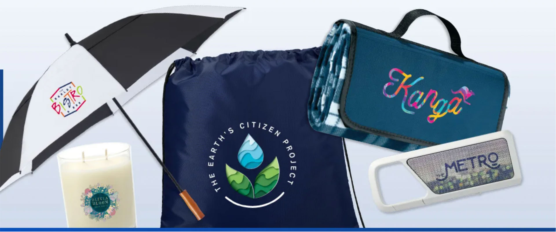
These days, there are many different ways a promotional product can be printed. Some common methods are screen printing, pad printing, digital full color imprint, embroidery, or dye-sublimation. Knowing all the different printing method options is so important, the logo specifications for each imprint method can be different. For example, most pens, stress relievers, or notebooks are printed with pad printing, and you will want to have a vector logo in a single color. A t-shirt that can be printed in full color digital, or dye-sublimation can have as many colors as you’d like in the design, and it does not even have to be a vector logo. You may be wondering, what is a vector logo? You will find that out next!
2. Vector vs Raster Logo
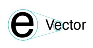
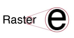
Let’s talk about what each of these types of logos is and why it is important to have both for various real-life applications. Vector images is a flexible image format. Constructed using mathematical formulas rather than individual colored blocks, vector file types such as EPS, AI, and PDF are excellent for creating graphics that frequently require resizing. Items that are printed with screenprinting, pad printing, and embroidery require a logo in this format to print properly. Raster image uses colored pixels to form a complete image. JPEGs, GIFs, and PNGs are common raster image types, and they are used mostly for websites and social media. Photoshop (PSD) and TIFF formats are high-resolution formats that can be used for full-color digital and dye-sublimation printing.
Common graphic design software, such as Adobe Photoshop is ideal for handling raster images and Adobe Illustrator and InDesign are used to create vector logos. Canva is a popular web-based tool for design but there are limitations in what you can create in vector. Designs in Canva can be exported as SVG format for vector printing.
3. Pick the Imprint Color
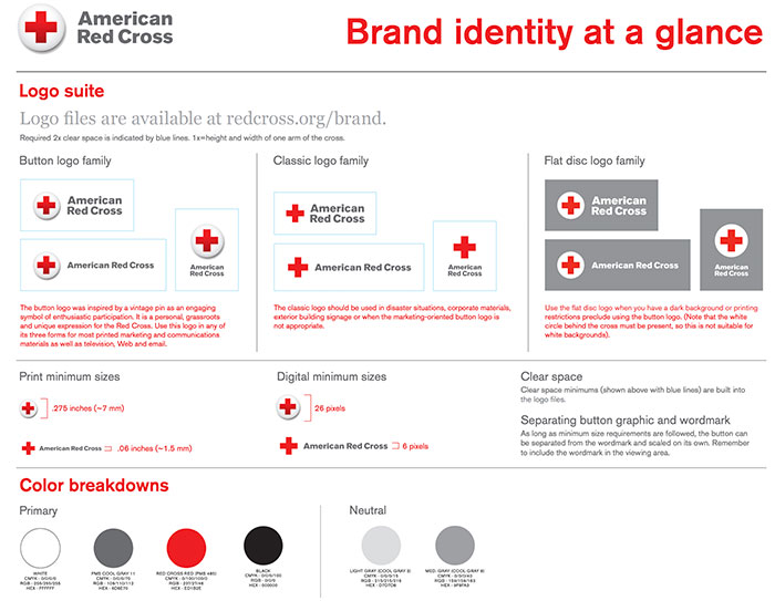
This may be an easy one, you think? Every marketing professional or designer should have this information handy. In our experience, many clients are frustrated that their logos have been printed in all different hues on business cards, brochures, company apparel, tote bags, and more. And the answer to this problem is a branding guide. A branding guide / style guide is a set of guidelines on how a company brand is presented to the world, both physically and digitally. It lets everyone in marketing, printing, and creative know how the different elements of the brand should be presented. Logo, fonts, colors, language tones, and design guidelines can all be included in a branding guide. It helps keep all interactions, including social media, mobile apps, print, and websites, consistent. For the purpose of this blog, picking an imprint color for screenprinting or pad printing, A Pantone color (PMS) is referenced. Logos that are in RGB, CMYK or HEX need to be converted to the closest Pantone color.
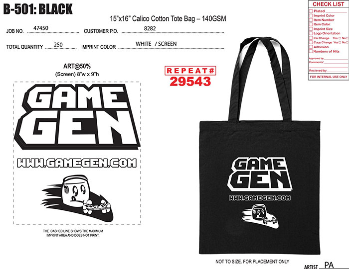
4. Ask for the Template / Artwork Proof
Once you have figured out the print method, got the correct version of the logo, and determined what color you will print, next you want to see how the logo will look on the item! We need to set up the artwork on a template. Your promotional products supplier should have templates for all the items they carry, and either you can place the logo on the template yourself, or they can definitely send you a virtual mockup. An artwork proof is a digital layout of how your logo will look on the item; it should show the size of the logo in relation to the item and the color(s) in the logo. This is an important step that should not be skipped to ensure your final product looks as expected.
5. Always Print Out the Virtual Mockup/Artwork Proof
This may be trivial, but very often the mockup looks great on screen simply because we zoomed in at 300%! On small items such as pens, stress relievers and lanyards, simple designs work best, otherwise, small details may be filled in and lost. The best way to get an idea is to print it on paper in actual size, so you can see the logo printed and inspect any loss of details, if any. Printing it out in actual size is important so that you are not viewing the item/logo in a zoomed manner,r similar to on screen. Verify all text spelling, font, logo/text size, imprint colors, logo placement, and any loss of details on the virtual mockup before approving.
Pre-production sample is also an option for most items. For an additional fee, we will print one item with your logo for you to review before proceeding to the actual order. This may be a necessary step for a large quantity order, or if you have had issues printing the designs in the past.
6. We can Help!
If you are reading until now, you may be thinking that this all sounds very technical and detailed, and I’m not sure if I am doing this right. We are here to help! We have handled thousands of designs and logo,s and we can let you know whether your logos are up to spec, create a virtual mockup, or make recommendations on how the logo will print the best. So let our experts help! Give us a call or contact us today.