Last updated on April 23rd, 2021 at 07:30 am
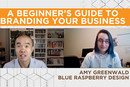
In this episode of the Small Business Show we invited graphic designer and branding expert Amy Greenwald from Blue Raspberry Design, LLC to give us an overview and importance of a branding style guide. Whether you are a solo entrepreneur or any size business owner, this is one that you do not want to miss.
A Beginner’s Guide to Branding Your Small Business simply put, branding is the “Distinctive wording or design used to identify a particular business, person or idea“. Sometimes you may hear people use the word logo and branding interchangeably, but they are not the same thing. A logo is part of the branding but not all of it. The branding of a company can include different versions of logo, supplementary design elements, color palette, font styles and copy. We will be going over some of them in details below.
![]()
A Logo is a symbol and represents the company. Amy pointed out that a logo is not necessarily what the owner likes, but rather it should resonate with the market the company it is in. When she designs a logo, there is usually a primary logo and secondary logo or stacked/long versions to fit different space requirements. All versions of the logo are related and consist of the same branding elements. An icon version works as a button on social media. A submark works well as additional graphic elements on tote bag designs, business cards or marketing materials. Promotional products come in different sizes and forms, so having promotional products logo variations will ensure the same message is conveyed.
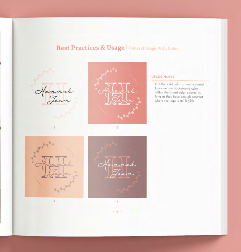
This section of the branding guide indicates how the logo can be used. The background color the logo is on to should have the best contrast and visual effect. It also sometimes define the minimum size the logo should be in order to be legible. Spacing, proximity to other text/images can also be included. Having best practices in the style book will make sure the logo is always presented in the same exact way no matter what the medium is.
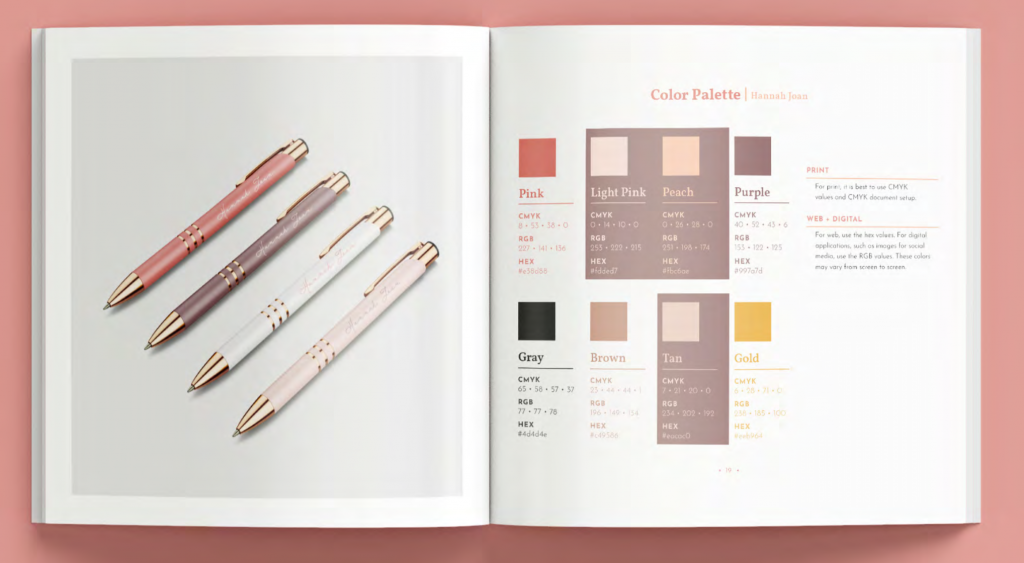
Every branding guide will have a set of colors chosen that best complement the logo. There is usually a primary color where the main heading or graphic elements is used, and a few secondary colors as well. The result is a harmonious set of colors and it allows customers to see those same colors and relate to the company right away.
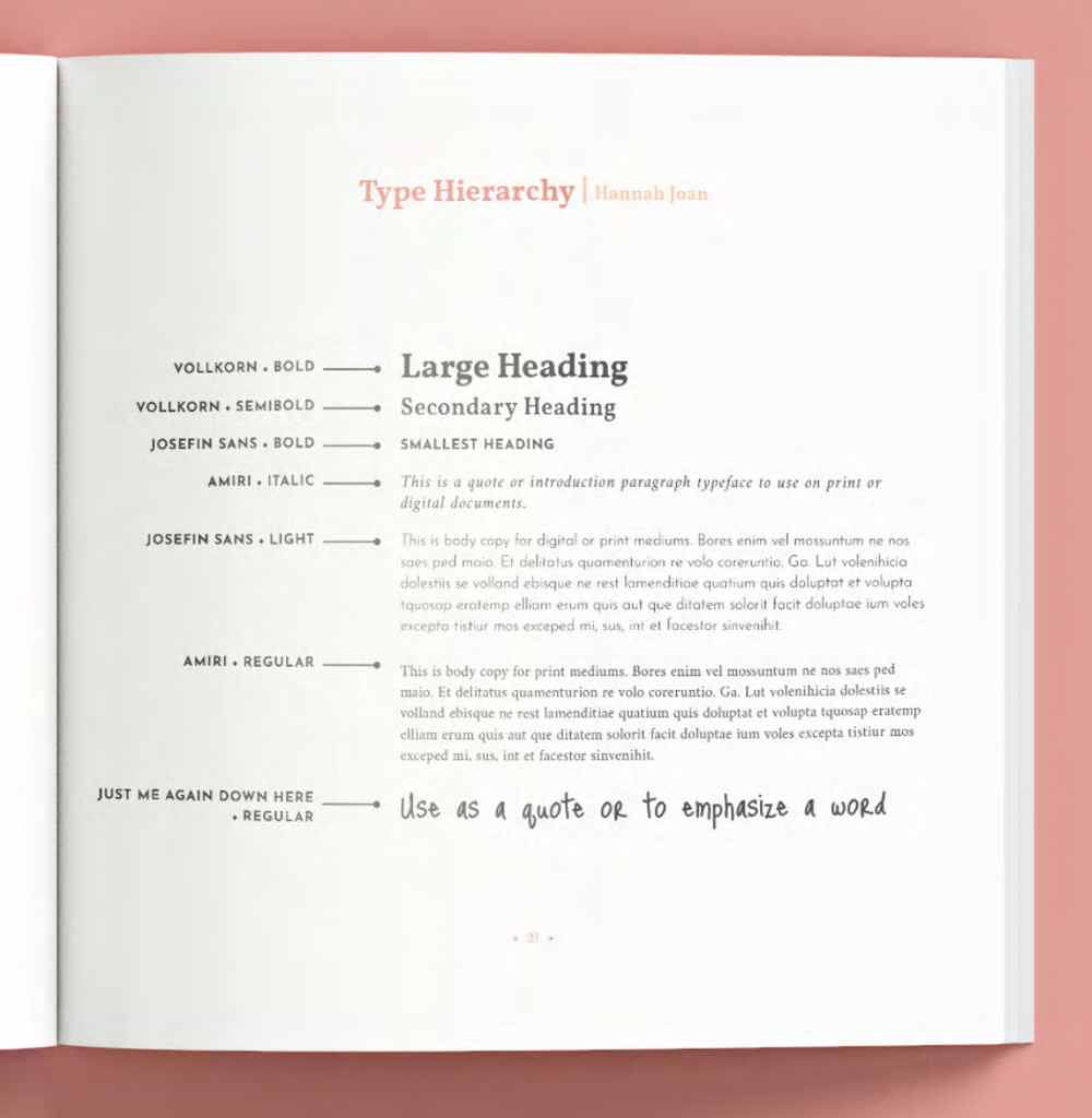
Whether it is on print or digital, a set of fonts are chosen and usages defined in the branding guide. Sometimes the fonts for digital files are slightly different for print. According to Amy, the most important thing to remember about font is that it is not necessary the fanciest or the one that you like the most, but rather it should be legible and uplift the brand and not distract. Font used for heading should be viewed at a distance and still be legible, so when it is printed on whether it is a promotional pen, mug or banner it is easy to read and esthetically pleasing.
A properly branding package will include various file formats for the company to use in different applications. For example, PNG file for web and social media, AI, EPS for print. Amy recommends business owners that even though they are not able to open some of the file formats, save all the files. Knowledgeable printers or web/social media designers would know the best version to use for the specific application.
A skilled graphic designer can interpret your branding guide and knows exactly how to work the logo in various products with the most compatible color combinations. He/She speaks the same language with the printer and will understand the requirements in order to have the best quality print possible.
From Amy’s and our experience, there are so many times when companies do not have the correct file format and the printed materials or promotional products end up being the wrong color, or simply wrong version! The upfront cost of a branding guide will pay for itself in the long run with the money and time saved, as you will not be reinventing the wheel every time you need something printed.
Every business needs a branding guide – other than esthetics, it’s about brand recognition. Especially in social media, when people see your post they don’t need to look at your name and know it’s your company. Having a consistent brand presence increases brand loyalty, value and ultimately sales. Whether you are photographer, construction company or software developer, it is as important as a business or marketing plan, it is a roadmap to your identity.
Images courtesy Amy Greenwald, Blue Raspberry Design, LLC
Swire Ho #thepromoguy (00:00):
Welcome to the small business show. My name is Swire from Garuda Promo. Today we have a graphic designer, Amy Greenwald from Blue Raspberry Design. How are you doing Amy?
Amy Greenwald (00:10):
I’m doing really well. Thanks for having me on Swire.
Swire Ho #thepromoguy (00:14):
Can you give all the viewer a background of what you do and how you get involved in graphic design?
Amy Greenwald (00:20):
Yeah, so, um, blue raspberry design is a graphic design branding, web design studio. we’re really focused on environmental and green graphic design. So we put the environment at pretty much the forefront of every single thing that we do. Um, but I really got interested in design kind of from a young age. I was always playing around in computer programs and making designs and such. Um, so yeah, then it just kind of turned into a career and I struck out on my own, and this is where I am.
Swire Ho #thepromoguy (00:48):
That’s great. Um, so today I know the topic we want to discuss is branding guide. So can you, uh, let the viewer know what is a branding guide and how can it, uh, how can a business benefit from having a branding guide?
Amy Greenwald (01:01):
Yeah. Um, you can definitely do that. Um, I can pull up the, uh, presentation here, um, to start showing on that. Um, so before really delving into a business branding guide, I wanted to back up just a touch and talk about what branding is. Um, I’ve seen a lot of, like, I think it’s Squarespace and their videos. They talk about how your brand starts with your website. Um, you know, and that’s not accurate. And then also a lot of people use the word branding and logo synonymously, and that’s also not accurate, like a logo is part of your brand, but it’s not your identity. So branding is really the distinctive wording or design use to identify your business, a person or an idea. Um, so I’ll focus on the visuals because I’m a graphic designer, um, but wording and stuff really does play a part into it as well. Um,
Swire Ho #thepromoguy (01:58):
Or copywriting, you know, how you describe the business. This could be part of your branding strategies too.
Amy Greenwald (02:03):
Yeah, for sure. Um, so I’ll share an example of one of the recent branding guides that I did. Um, so this is for Hannah Jones. She just graduated college, um, and is going out into the job market. So it’s really put our best foot forward. She wanted a personal brand to highlight who she is. Um, so this is what I put together for her. Okay. Um, so you can see right away, it does start with a logo, um, the guide itself. So it, it really does talk about though, you know, it’s not about what you like, it’s about what does this mean? So the logo really needed to represent how fun, open, energetic, um, and like modern, um, Hannah approaches things. Um, so it needed to represent her as well as resonate with the market that she was talking to. Um, and then on top of you need kind of more than one logo, you need like a whole logo system in your brand. Um, so while the first one is very square would work really well in those types of scenarios. Maybe if you’re thinking about like a business card and you want it to be horizontal and you want the logo to take up the majority of one side of it, the secondary logo might work better because it’s more horizontal with the name on one line. Um, but they still relate to each other. And they’re still all part of the same branding elements.
Swire Ho #thepromoguy (03:28):
That’s a perfect option because, you know, we will have client, obviously most people design their logo for their website and business card. They never designed a logo for promotional products, but they’re not promotional product. There are 5,000, 10,000 different type of service, you know, like you said, you know, one good for maybe a square, maybe a circle, but then you can print a circle, uh, type logo on a pen, as well as, you know, the secondary logo that you have. So that’s, that’s a perfect example.
Amy Greenwald (03:56):
Right. Very true. Um, yeah. And then kind of more on top of that, um, you know, there’s an icon on a tight Mark that was also developed for Hannah. So like yeah, the icon that would probably work really well on like a button or, you know, social media and stuff like that. And then the tight Mark is more where you don’t have that space to put the whole thing. So like what you said with the pen, maybe the whole secondary logo doesn’t fit. So then you just go to the type Mark. Um, and then also because of how this logo was set up with the primary and secondary, um, secondary tire Mark was also developed for Hannah. Um, and then lastly, a sub Mark, and I use this term very loosely for some Mark, but really it’s just kind of a nother Mark that’s adjacent to the logo. So this one could work really well as like a frame to photography or, um, you know, even with promotion materials, maybe it’s like an accent on like a bag or something like
Swire Ho #thepromoguy (04:55):
The Mark, right. Like to, when we, when I have like all the banners around the show right now, so kind of like those to make it, you know, consistent with the brand. That’s, that’s very nice.
Amy Greenwald (05:05):
Yeah, exactly. Um, and then also along with the guide, so it lays out all these resources that you have to use, but it also talks about the best practices and the usage. Um, so like you don’t want to use the black with the light pink on like a really dark color. It’s really going to wash out the logo. You want to be more, um, conscious of how you’re using it. So, I mean, that ties into all promotional materials, printing and stuff too. Like if you have a darker colored, um, you know, piece of fabric or something, you know, printing black on it, isn’t really going to work. It’s not going to be recognizable, especially not from a distance.
Swire Ho #thepromoguy (05:46):
So you, you actually finished the guide and then you teach Hannah, how do you use the branding guide basically?
Amy Greenwald (05:52):
Yeah. Yup. Um, and then throughout the whole thing, there’s like small usage notes. And just as a reminder of like, Oh yeah, this is what this means. Um, type of a thing. So yeah, it really becomes like their roadmap to their brand. Um, and then also how to use it with photography as well. Um, Hannah herself was actually a photographer, but I mean, even if she wanted to work with somebody else, you know, she could go to the photographer, show them this page and be like, okay, this is how my brand needs to work with these photos. Let’s talk about what their composition needs to look like in order to keep the brand consistent. Um, so yeah, it can really work on multiple levels in that sense. Um, and then also to talk about, so a lot of the, the, um, logos have a lot of different colors to them, but really defining a color palette.
Amy Greenwald (06:43):
And this keeps everything consistent because colors, you know, one of those first immediately recognizable things and you want everything to be consistent, you know, even if you use pink, there’s how many different shades of pink a ton. So you want to like be able to reference back to the same one, or get it as close as possible. Um, really with everything that you do. Um, and then same goes for fonts, like say you’re creating a brochure or something, you know? Okay. You’re like, I, I know that my headings need to be in this font to keep consistency. This is what my body copy should be, so that it’s legible. Um, and all those things,
Swire Ho #thepromoguy (07:24):
What I have thought on fonts, because you know, as a client, sometimes they want something more fancy, more elaborate, but then when it comes to printing, as a printer, a lot of times there are fonts that will not print as well. Then the standard blocky fots, like how do you balance the design and then the actual functionality when it gets to the printing standard?
Amy Greenwald (07:50):
Yeah. Um, I have run into that a lot too. I think one of the main things is that there’s ones that I defined very much for, like, this will work much better in a digital space and this will work much better in a print space. So just to understand the limitations of the actual font, but also I think when selecting fonts to use in a brand, even if I find one that I really like, and it’s like not quite legible, it gets tossed out because, you know, a fonts purpose is to uplift not to distract. And I think in a lot of cases with that showing clients like the difference of, okay, this is what that font that’s really fancy looks like. And this is what a very clean blank legible font looks like. Um, especially with promotion materials, I feel like the distance test is always important. Like how close do you need to be to something to act?
Swire Ho #thepromoguy (08:37):
Yeah, because sometimes the phone are so small, uh, it won’t be legible. Right. And especially sometimes we’re limited to the physical imprint area of the piece. So there may be, they’re doing a pen or they’re doing a banner. So, uh, you know, you can see us both. I said, you on the banner on a pen.
Amy Greenwald (08:57):
Right, exactly. Yeah. And I think that’s to where the, uh, the different logo styles come into play too. And yeah, that’s kind of why the whole font guide exists to, to hopefully try to help guide that a little bit. Um, yeah. For printers and the business owners.
Swire Ho #thepromoguy (09:14):
Well, so what is the creating process? Is this, this should tell you the idea of the client area, the idea, and then you create a style guide for them, or how do you find a font that both looks nice on the eye and works well from the printing standpoint or on a website.
Amy Greenwald (09:33):
Yeah. Um, so actually, let me skip ahead a little bit. So the process, yeah. Um, really a lot of it, it starts by backing up like a ton. Um, I always like to guide clients through a, a workbook of like, what are your values? Like what truly drives you? Um, and so that’s kind of where the conversation starts so that when they say that they want the font that is, you know, a lot more fancy or something it’s like, okay, does that reflect your values? And if it does, how do we have that conversation of showing them like, okay, this is what it actually looks like printed, um, versus this is what it could be. Um, so yeah, really, I think a lot of branding and design is based on just conversation and really getting to the, like the meat of why they’re doing what they’re doing.
Amy Greenwald (10:26):
Um, and yeah, digging up from there. Um, but yeah, I am a fan of options as well. So like when I did start with Hannah, these were the three logos that I initially showed her as. Um, so the first one, obviously that’s the one that you picked. Um, the middle one was personally my favorite, but I mean, you know, it doesn’t matter what the designer wants is their favorite because it’s all about the client. It really is. Um, and that one ended up being a little too elegant for who she was and a little bit too rigid and professional. Um, and then the third one was completely in the opposite direction where it was too playful, too fun, not professional enough. And so the first one ended up really being that mix. So yeah, I think that, um, you know, showing options, talking about why they resonate the way that they do, why you like, what you like, why you’re really passionate about something. Um, yeah.
Swire Ho #thepromoguy (11:24):
And I liked that, you know, the, this is like the complete logo, but then you’re able to take away different elements and create a different version or a secondary logo based on, you know, the full logo that you have on the screen right now.
Amy Greenwald (11:37):
Right? Yeah. Yeah. That’s personally one of my favorite parts. Um, and you know, I think everything that we’ve talked about with how there’s so many different applications, um, you know, that’s one of the reasons why I don’t deal with just logo creation, it’s you get a brand guide or you get kind of, but when you work with me, because it’s too important of a thing to ignore, um, yeah. It just, it works together so much more as a system.
Swire Ho #thepromoguy (12:03):
Do you notice that sometime when you create a branding for a business it is so obviously it’s for elaborate, you know, a lot of details into it, you know, as we can see, um, do they know how to use it? Like, or maybe like in the beginning they all excited, you know, they want to show everybody, but then, uh, you know, I think when Klein that I talked to you and sometime when they send us logo, they only send us a JPEG or PNG or like a low resolution business logo, because I’m sure that you send them to high resolution file, like illustrator, AI, EPS, but then they couldn’t open it. So they didn’t think that it’s important. So after like a few years normally, uh, then they don’t have those files anymore because they, they thought it’s this file that they don’t eat. So they end up having only the raw, low rest format. So how would you suggest people to use the branding guide you have created?
Amy Greenwald (12:53):
Yeah. Um, so actually, so this is one of the pages that I, yeah. I want to highlight with how they use it. So in the beginning of every single book, there’s this brand file formats. Um, and it tells everybody like, why you need these files? Like, what are they exactly. Um, and it talks about vectors versus image file, like vectors, you know, designers, printers, we all know what it means, but I’ll tell a client, do you have a vector of that? And, you know, nobody knows what it is. Um, so yeah, this breaks it down really well. Um, with saying like the AI file or the EPS file that’s for print, you can scale it infinitely, um, it’s transparent and then breaking down how P and G and J Piger for web, um, and then same with an SVG for web developers. And then that’s represented on how the file structure is put as well. So the folders are labeled like for print use. So hopefully people will go into this and be like, okay, I’m printing something. I need to go into the for print use file folder. Um,
Swire Ho #thepromoguy (13:53):
Yeah. I love when clients send us a branding guide. Then we know the files will print well. So that’s for us. And, uh, and I like, you know, especially with your design to like tell you exactly what color you can use, what color don’t can use. So when we choose promotional item for a client, if we have a branding guide, then my process to help them find what they’re looking for is a lot faster. So I eliminate already all the colors that they don’t meet, that doesn’t be on brand. I just show them what’s available with the color that they want.
Amy Greenwald (14:26):
Yeah. Yeah. And that saves everybody time. It saves everybody money. It’s, you know, this initial investment up front, it, it really is so smooth as, and it can be used for years. Yeah, for sure. Um, yeah. And then that’s also part of why each logo has different color variations as you go deeper into the file structures and it’s broken down like that. I think I, when I sent this, Hannah probably got about 150 files, which sounds like a lot, but when it’s broken down in like the purpose and how you’re using them, it, it becomes very manageable and not overwhelming to look at and dig through. Um, so yeah, that’s the goal anyway.
Swire Ho #thepromoguy (15:05):
Okay. So, um, tell us more. So for obviously we see your example of Hannah that, you know, uh, working with a graphic designer can obviously, uh, enhance your brand image. So, um, in terms of promotional product, because we deal with a lot of different items, or, you know, they have different print area, how can a designer design a better business logo for promotional products?
Amy Greenwald (15:33):
Yeah. Um, so I think that a designer really helps because designers and promotional product, like we speak the same language almost, you know, like if I’m talking to you about color space and you tell me, you know, it needs to be CMYK and it needs to be this many DPI, or it needs to be a vector. I immediately know what those words mean. Whereas, you know, a client who’s in a, um, internal, let’s say like real estate company or something, it’s just not in their vocabulary because it’s, you know, different industries. Um, so really the expertise and the knowledge that comes with a designer, it saves time for everybody because, you know, you don’t need to learn this whole new industry. Um, it’s all just laid out for you in that sense. Um, yeah.
Swire Ho #thepromoguy (16:21):
Okay. My last question is, do you think only people in the creative industry, let’s say Hunter is our photographer socially, obviously in their creative industry, do you think there are only certain type of business we’ll need a branding guide? And what are your thoughts?
Amy Greenwald (16:37):
I think every business could use a branding guide quite honestly. Um, because, so it’s really, you know, it’s not about necessarily, it is about looking good and looking nice, um, and having a really great aesthetic to it. But it’s also about that brand recognition. Like, um, if you’re scrolling through Instagram and you follow some businesses, you know, when you see somebody’s posts, you want to be able to, you want your audience to be able to recognize that it’s you immediately without even having to read your name. Um, and that really leads to the recognition and the brand loyalty that comes with it, because you’re going to know what you’re getting, and it’s going to increase that trust. And it’s going to increase your sales in that sense too, because they’ll know that it’s you. And if they already like you, they’re more likely to purchase from you. Um, and also I think, you know, it, it just saves time, whether you’re a photographer or in the construction industry, or, you know, like a software developer or something, having a guide book to reference back to, you’re not going to be reinventing the wheel every single time you design something, even as you change and grow, um, you know, the brand really lends itself to help you do that. I totally, because, you know,
Swire Ho #thepromoguy (17:50):
We all be in a daily life and if I name, uh, you know, coffee, uh, mattresses, you know, uh, tennis shoes, then we already have a brand in mind and we know what their brand and kind of look like. Um, and then I think by having a branding guy, uh, the often cost, uh, justified at the end, because I couldn’t tell you how many times, you know, that we try to save the client’s logo because we couldn’t find the right format. But then if it’s done by a professional designer and you have all the format like, uh, Amy is showing here all the structures, uh, if any printer that is being a business and they know how to, you know, read the file, then you can go wrong. You won’t, a lot of times people print the wrong logo and you have a thousand of items and it’s the oversharing of the logo that maybe they save it, you know, on the previous version, this will give you all the details, you know, uh, anywhere in the world, I would say, you go, if you send them to fire with a guy, it will be the same color.
Swire Ho #thepromoguy (18:51):
It will be the same format. Uh, that’s how a big brand like Coca-Cola will probably do. And a small business can also benefit from this by having a branding guy who details it kind of like a business plan. You know, you gotta go, uh, to a business without good business plan or do marketing with Madigan marketing print. Brendan guy is, uh, you know, something that a business gotta think, uh, in inside too, because as, as you grow, you’re going to have more, uh, you know, exposure on website, on social media, on print or trade show. Uh, this is very important. So, uh, I’m, I’m glad that Amy, this is a wonderful example. Uh, and then, you know, it’s a great showcase of, uh, you know, what a branding guys can do for business.
Amy Greenwald (19:35):
Yeah, yeah, absolutely. Everything you just said, spot on. Agree with it a hundred percent. Yeah. I think it’s definitely a essential way to brand a small business.
Swire Ho #thepromoguy (19:45):
All right. Thank you so much, Amy. I’m going to put your contact information in the post and if a viewer of more question about Brandon Guy do reach out to Amy and thank you so much for coming on today. I mean,
Amy Greenwald (19:56):
Yeah. Thank you so much for having me, right. Bye.